100 Selection in Changhua
Branding_Identity
"The 100 Selection in Changhua" project carefully selected the highest quality products from local businesses. Its main purpose was to celebrate the hard work of creators and provide customers with a fresh branding impression
Client: Jabez.INC
Client: Jabez.INC
The problem
The local products need an official credential to ensure their quality and support the marketing strategy
The local products need an official credential to ensure their quality and support the marketing strategy
The goal
Create a distinctive branding identity that represents and recognizes the local businesses that produce high-quality products.
Create a distinctive branding identity that represents and recognizes the local businesses that produce high-quality products.
My role
Visual designer and project manager
Visual designer and project manager
Responsibilities
Designing the logo and identity system, and presenting and communicating the design to the client were all part of the process.
Designing the logo and identity system, and presenting and communicating the design to the client were all part of the process.
_
The First Solution
_


第一版本的提案設計以中文「百」字以及盒立體架構為主要形式表現,表達百寶箱裡的好商品概念。豐富清新的色彩計畫,提供彈性靈活的元素組合,並能同時維持視覺的一致性不紛亂,為其最主要的特色。
The logo concept was derived from the Chinese character (百), which signifies a hundred. The box shape of the logo was chosen to convey the idea of high-quality products being contained within. The color scheme was selected to be fresh, energetic, and easily combinable, ensuring visual consistency across all materials. As the designer, I presented and communicated the design to the client throughout the entire process.
_
The Finalized Design
_
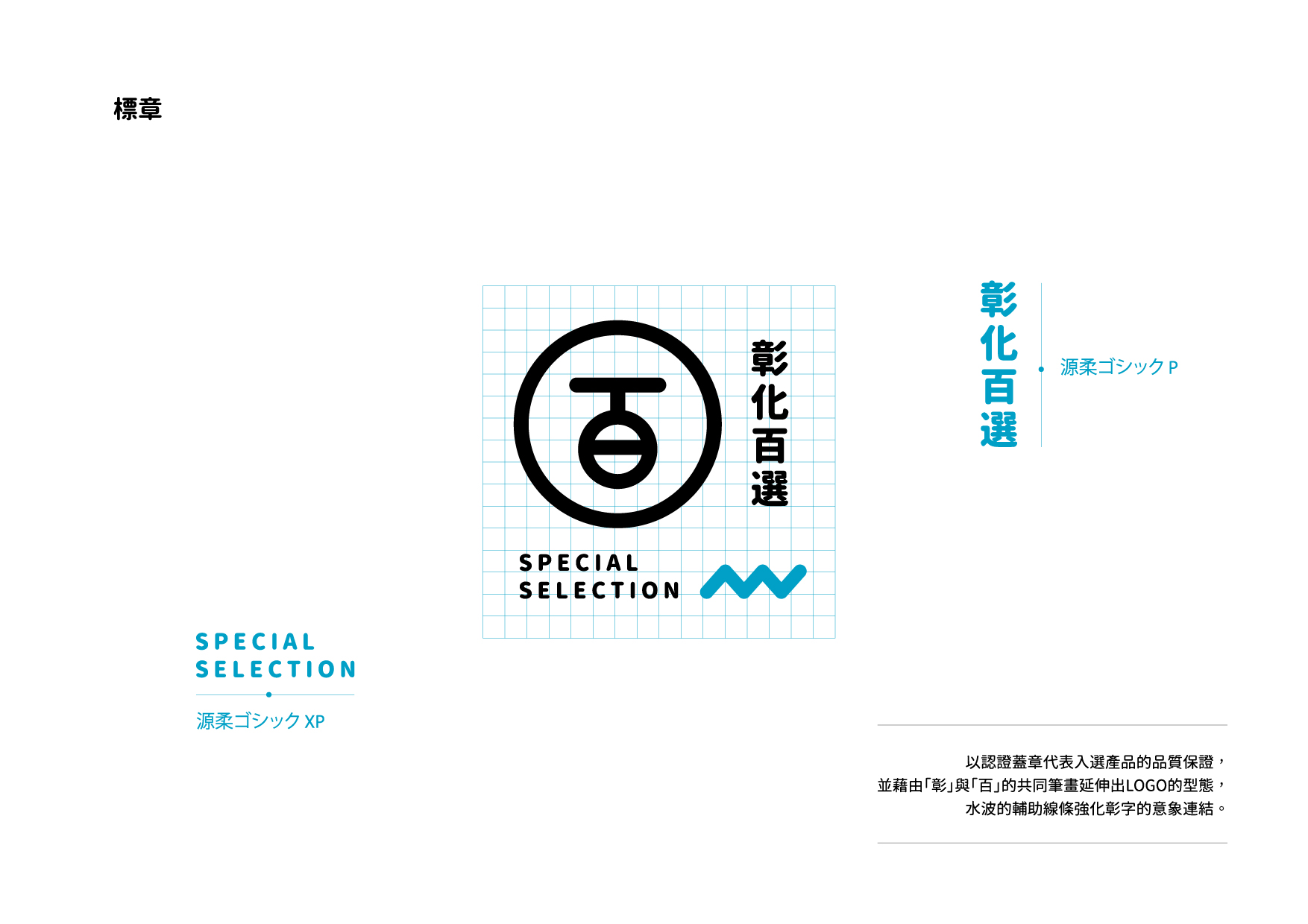

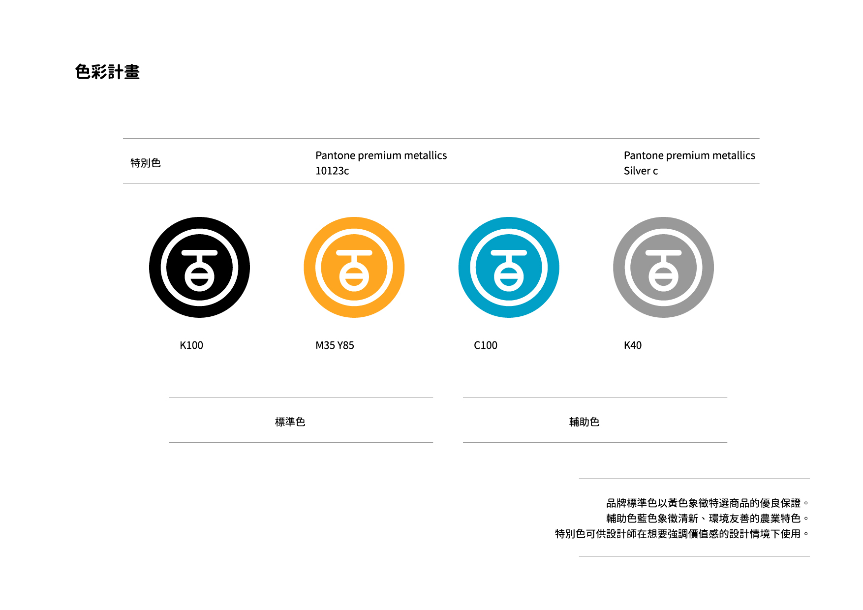
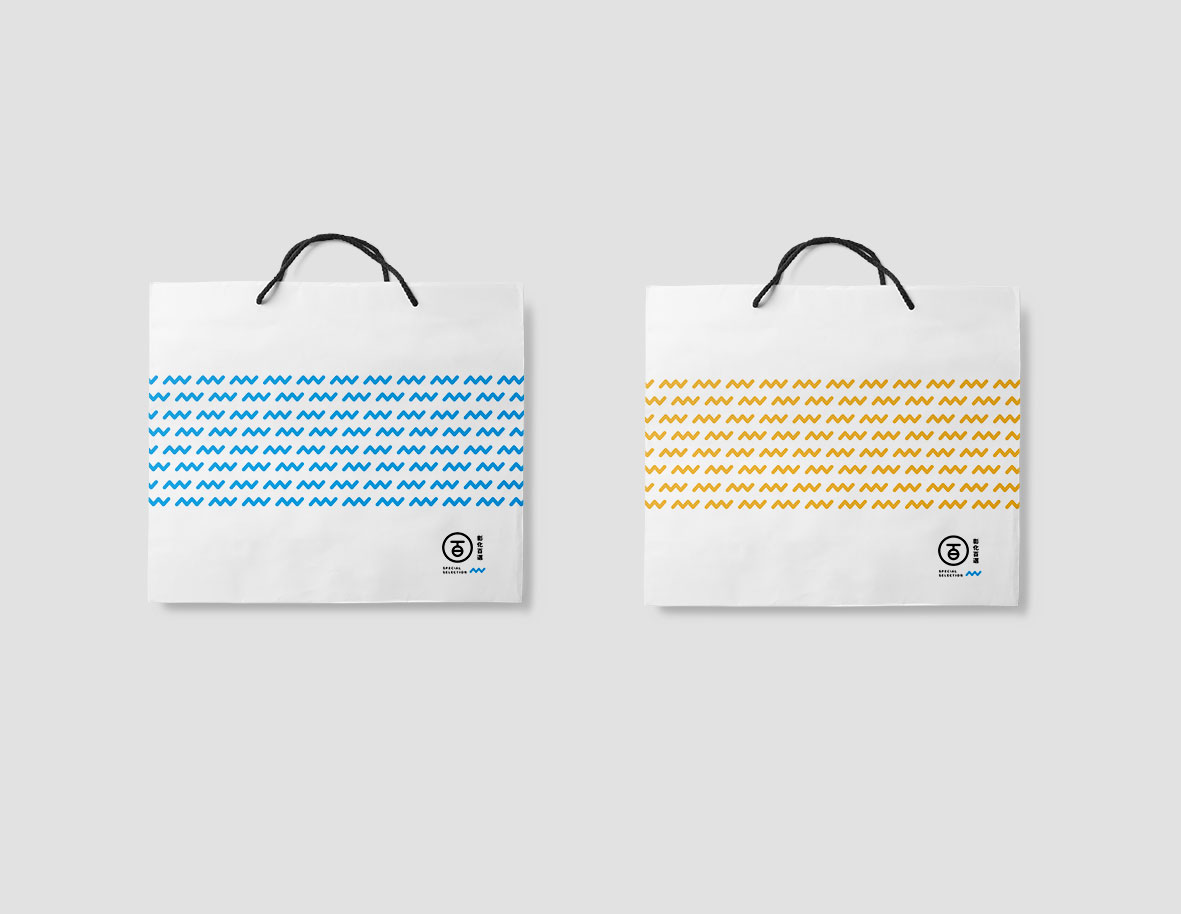
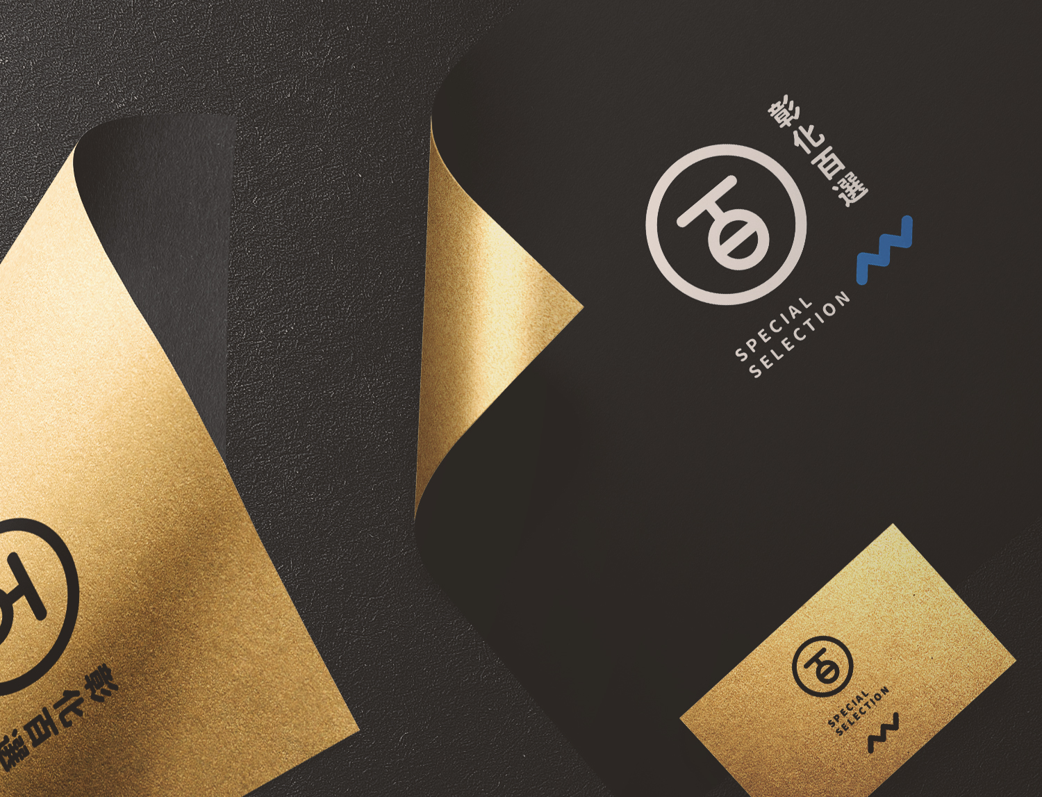
最後定案的版本是以圖章概念以及彰字的水紋印象結合而成。藉以創造具有現代感且保有樸實的文化意象。
The final design drew inspiration from the concept of a stamp, symbolizing an official guarantee for the selected products. The use of blue color represents the importance of water, a vital element in the Chinese character of Changhua.