Kickbone Coffee Roaster App
Case Study
Kickbone Coffee Roaster is a dynamic and vibrant small business, dedicated to delivering premium specialty coffee of the highest quality. Their mission is to assist customers in discovering the perfect coffee blend to suit their preferences, while providing a delightful user experience when engaging with their products.
Client: Kickbone Coffee Roaster
Client: Kickbone Coffee Roaster
The problem
Consumers often struggle to find the right coffee when shopping online, which can be frustrating and time-consuming.
Consumers often struggle to find the right coffee when shopping online, which can be frustrating and time-consuming.
The goal
As a UX designer, my goal is to design an app for Kickbone Coffee Roaster that provides a seamless and engaging ordering experience, allowing users to easily discover the coffee they love.
As a UX designer, my goal is to design an app for Kickbone Coffee Roaster that provides a seamless and engaging ordering experience, allowing users to easily discover the coffee they love.
My role
UX designer designing an app for Kickbone Coffee Roaster from conception to delivery.
UX designer designing an app for Kickbone Coffee Roaster from conception to delivery.
Responsibilities
Conducting interviews, paper and digital wireframing, low and high-fidelity prototyping, conducting usability studies, accounting for accessibility, and iterating on designs.
Conducting interviews, paper and digital wireframing, low and high-fidelity prototyping, conducting usability studies, accounting for accessibility, and iterating on designs.
_
Understanding the User
_
在進行訪談後,我使用同理心地圖分析了解使用者的需求,顯示主要的使用族群人們想要透過設定自己的喜好尋找喜愛的咖啡豆。
這個使用族群驗證了原本對於店家客群面貌的假設。但研究同時也揭露了過於艱澀的咖啡豆資訊以及無趣的訂購過程,讓消費者無法好好地替自己挑到適合的產品。
這個使用族群驗證了原本對於店家客群面貌的假設。但研究同時也揭露了過於艱澀的咖啡豆資訊以及無趣的訂購過程,讓消費者無法好好地替自己挑到適合的產品。
To ensure that the app I was designing for Kickbone Coffee Roaster met the needs of their customers, I conducted interviews and created empathy maps to gain insights into their preferences and needs. Through this research, I discovered that many users wanted to easily customize their coffee preferences, such as flavors, to quickly find the coffee they love.
While this confirmed initial assumptions about Kickbone Coffee Roaster's customers, I also found that customers often found the abundance of information about different coffees and complicated ordering processes overwhelming, making it difficult for them to select the right coffee.
While this confirmed initial assumptions about Kickbone Coffee Roaster's customers, I also found that customers often found the abundance of information about different coffees and complicated ordering processes overwhelming, making it difficult for them to select the right coffee.
_
Pain Points
_
透過人物誌以及使用者旅程地圖歸納出三個使用者痛點:在內容的部分,過於專業的專有名詞讓人們在知識不足的情況下,難以挑選適合的咖啡豆。此外,消費者需要簡單、容易理解、反映出產品特點的自訂選項功能,幫助他們快速尋找所需品項。在使用經驗部分,無趣的訂購流程與在實體店購買相比,失去討論交流的樂趣。
Content
Users lack knowledge of coffee terminologies, leading to difficulty in choosing the right coffee.
Custom Features
Users need clear and easy-to-understand features that represent the products' unique selling points to help them make informed decisions quickly.
Experience
A complicated order process detracts from the overall user experience and makes buying online less enjoyable than in-store.
_
Personas
_
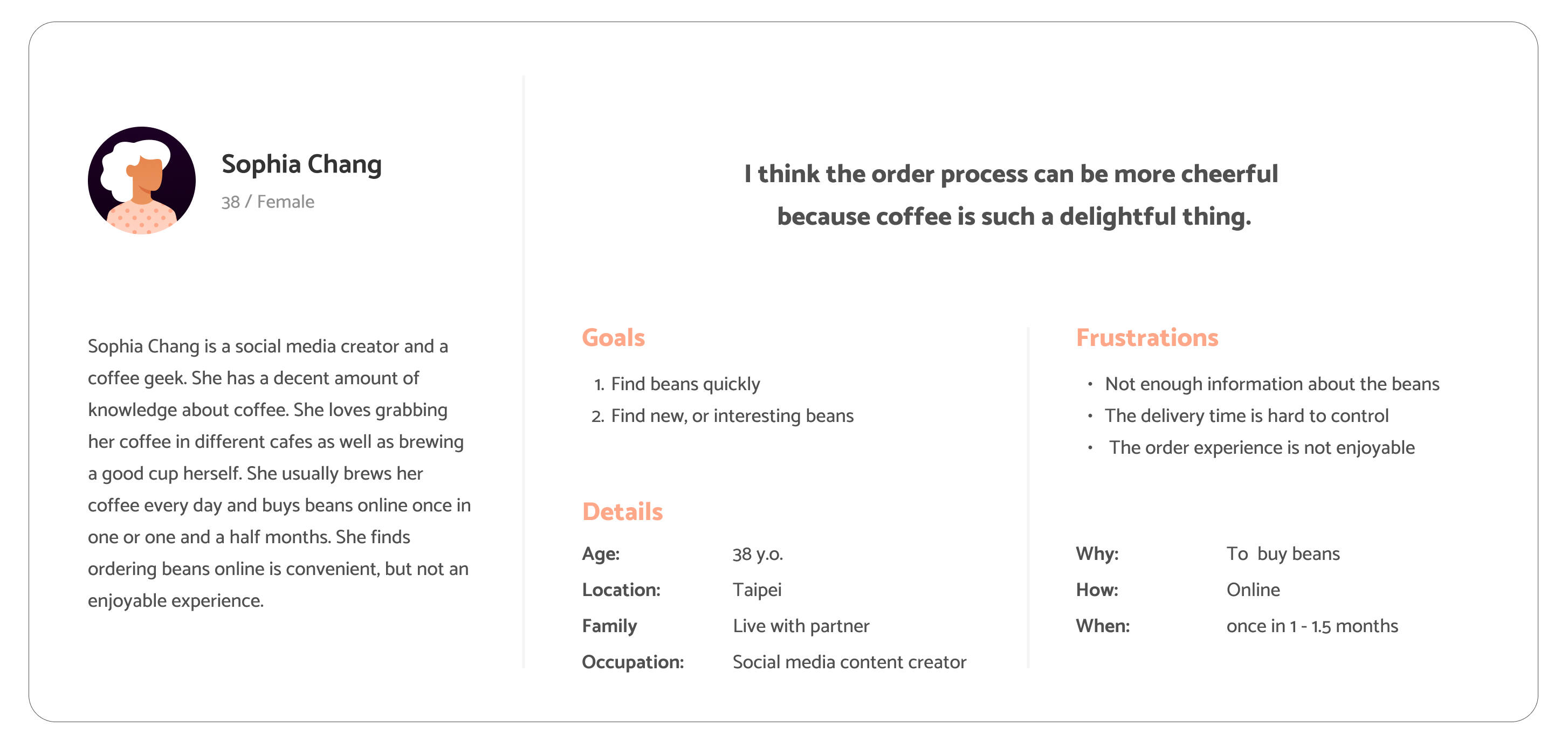
Persona: Sophia Chang
Problem statement: Sophia is a coffee lover who needs the filter feature because she does not want to waste time browsing products she does not like.
Problem statement: Sophia is a coffee lover who needs the filter feature because she does not want to waste time browsing products she does not like.
Persona: Jason Lee
Problem statement: Jason is an amateur who needs general information to help him choose the right coffee because he does not have much knowledge about it.
Problem statement: Jason is an amateur who needs general information to help him choose the right coffee because he does not have much knowledge about it.

_
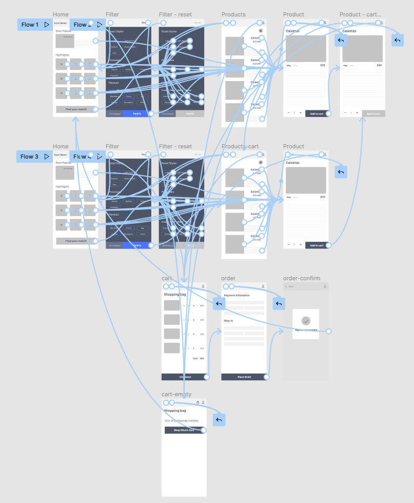
User Journey Map
_
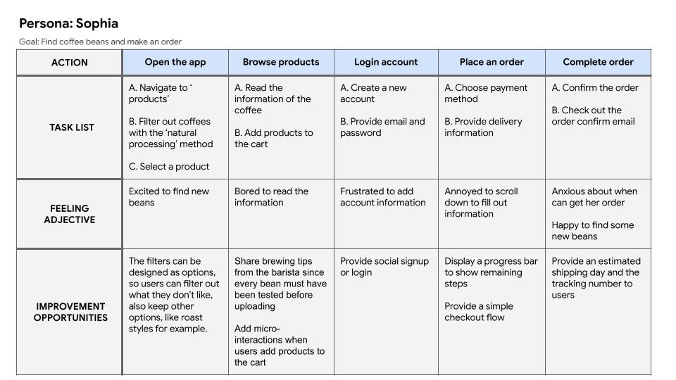
_
Starting the Design
_
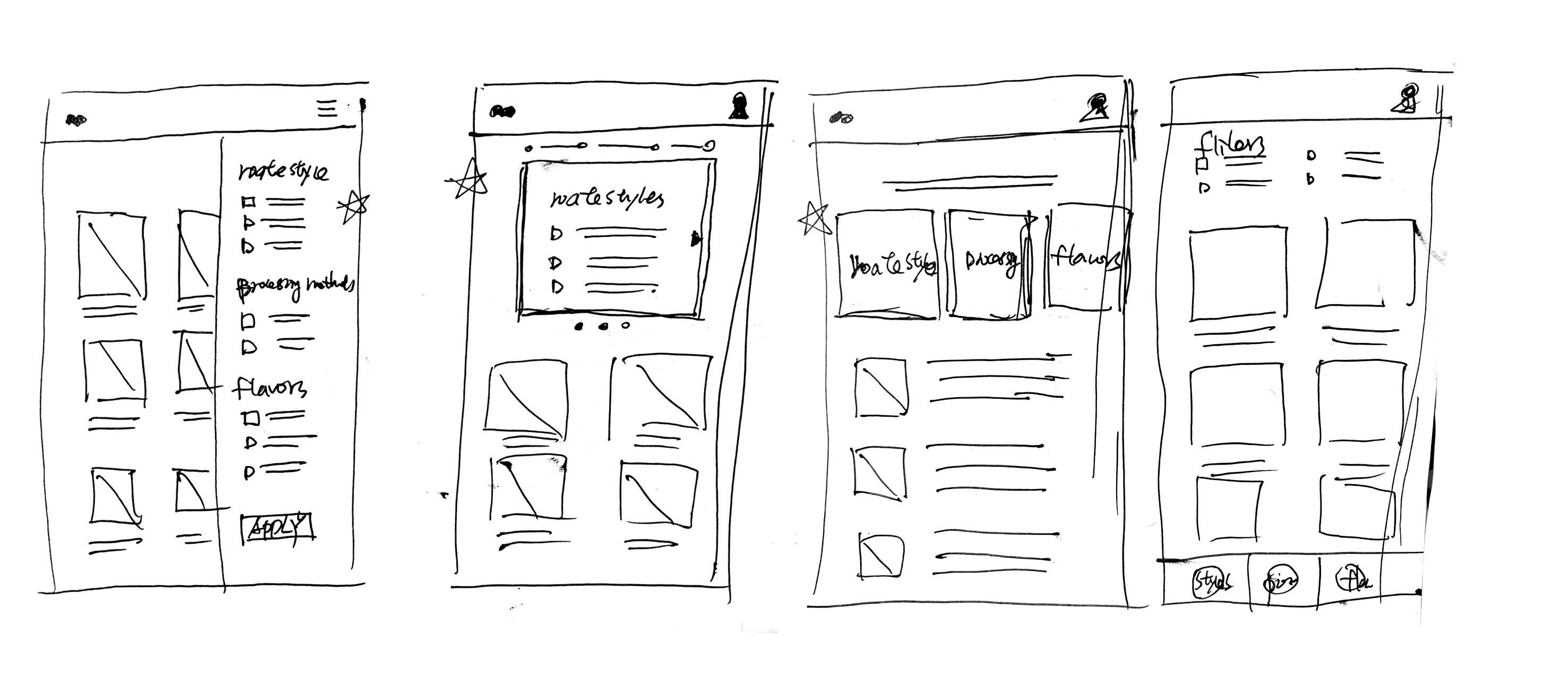
Paper wireframes
Drafting multiple iterations of each app screen on paper allowed me to create digital wireframes that were well-suited to address user pain points. On the home screen, I prioritized popular coffee and filter features to enhance user decision-making and engagement.
Stars were used to mark the elements of each sketch that would be used in the initial digital wireframes.
Digital wireframes
As the initial design phase continued, I made sure to base screen designs on feedback and findings from the user research.

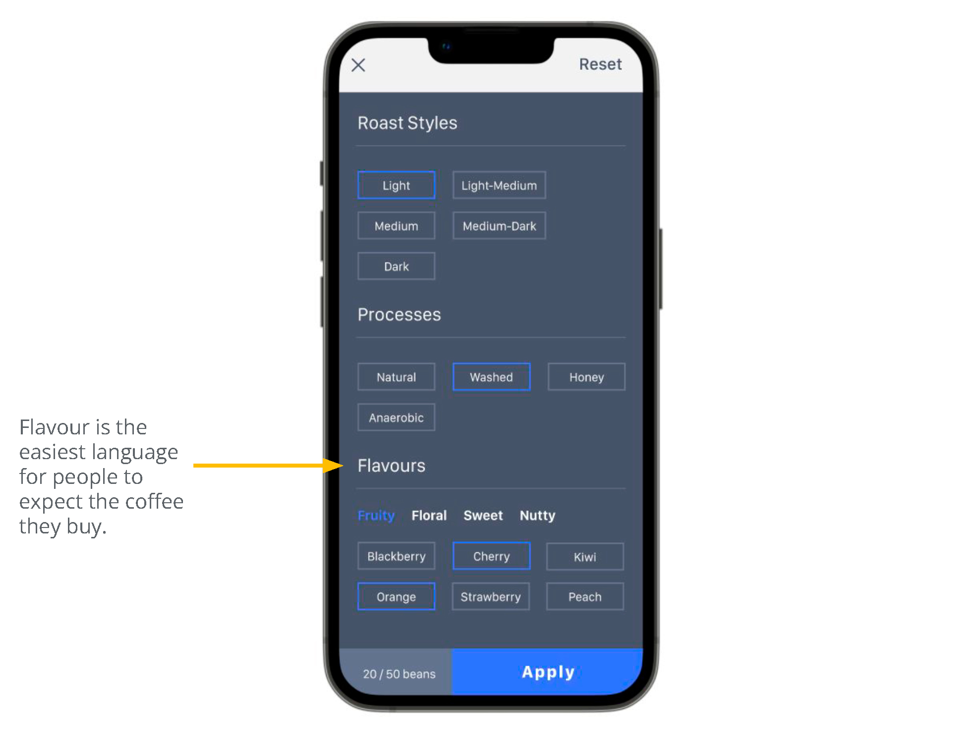
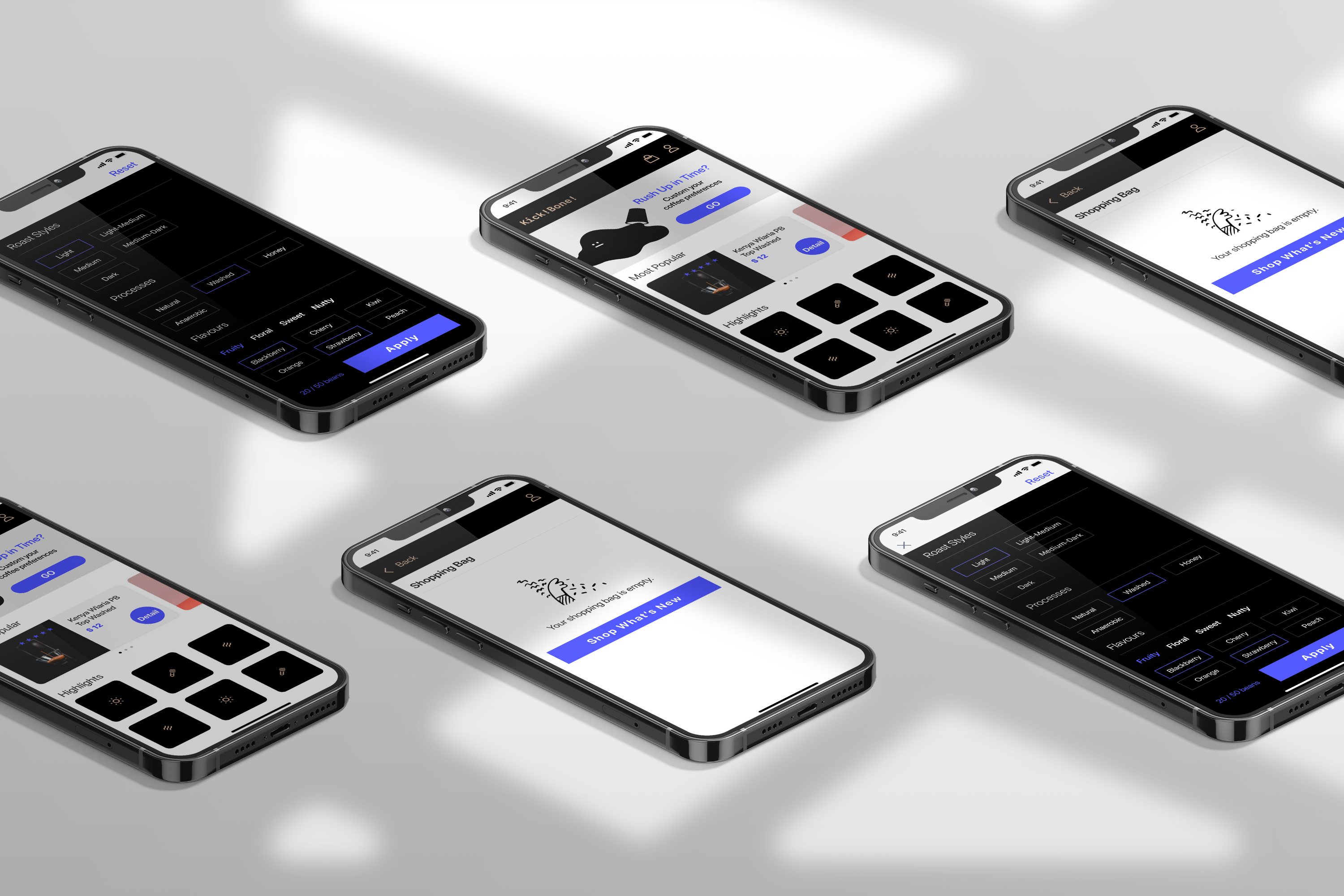
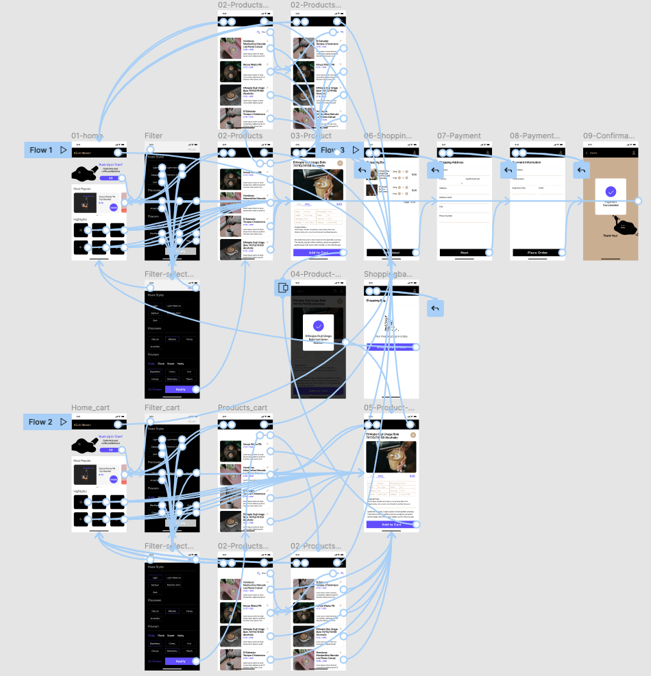
Lo-Fidelity prototypes
After completing the digital wireframes, I developed a low-fidelity prototype that focused on the primary user flow of customizing preferences. This prototype was then used for a usability study, which helped ensure that the app would effectively address user needs and pain points.
View the Kickbone Coffee
︎︎︎ low-fidelity prototype
_
Usability Study: Findings
_
第一次的使用性測試發現:
▸ 使用者認為篩選功能很有用
▸ 使用者認為篩選功能在首頁不是很明顯
▸ 使用者認為在將商品加入購物車後,需要一個確認提醒訊息
第二次的使用性測試發現:
使用者想要依照價格排序產品的功能
▸ 使用者認為篩選功能很有用
▸ 使用者認為篩選功能在首頁不是很明顯
▸ 使用者認為在將商品加入購物車後,需要一個確認提醒訊息
第二次的使用性測試發現:
使用者想要依照價格排序產品的功能
I conducted two rounds of usability studies. Findings from the first study helped guide the designs from wireframes to mockups. The second study used a high-fidelity prototype and revealed what aspects of the mockups needed refining.
Round 1 findings
Round 2 findings
Round 1 findings
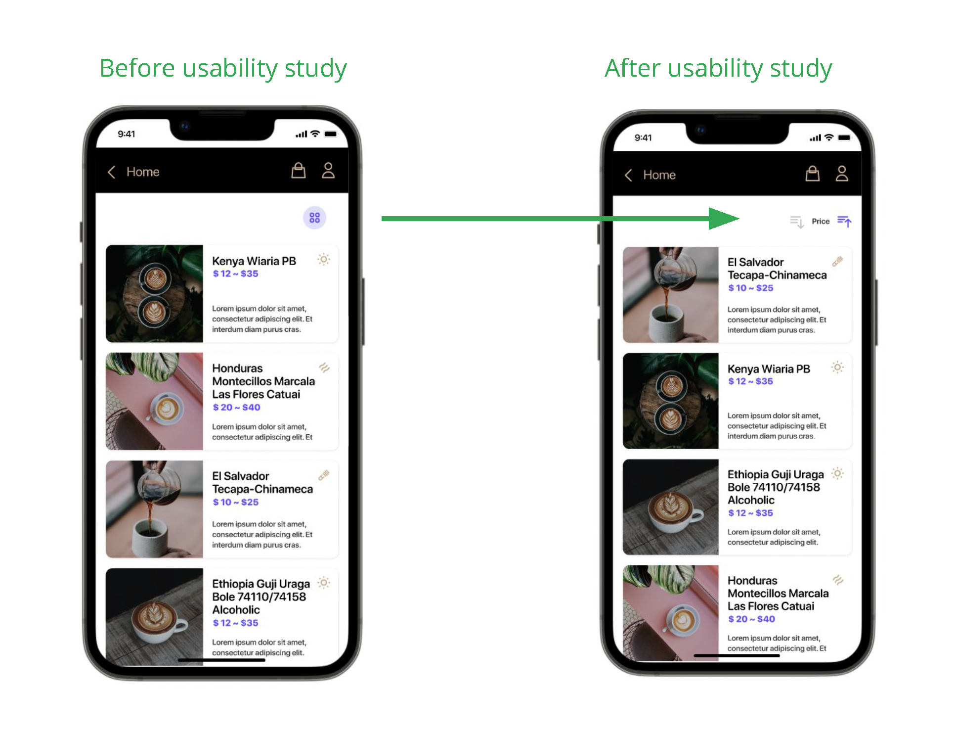
- Users find the filter feature useful
- Users find the filter feature is not obvious in the home screen
- Users want a confirmation when they added items to the shopping cart
Round 2 findings
- Users want to sort items by price
_
Refining the Design
_
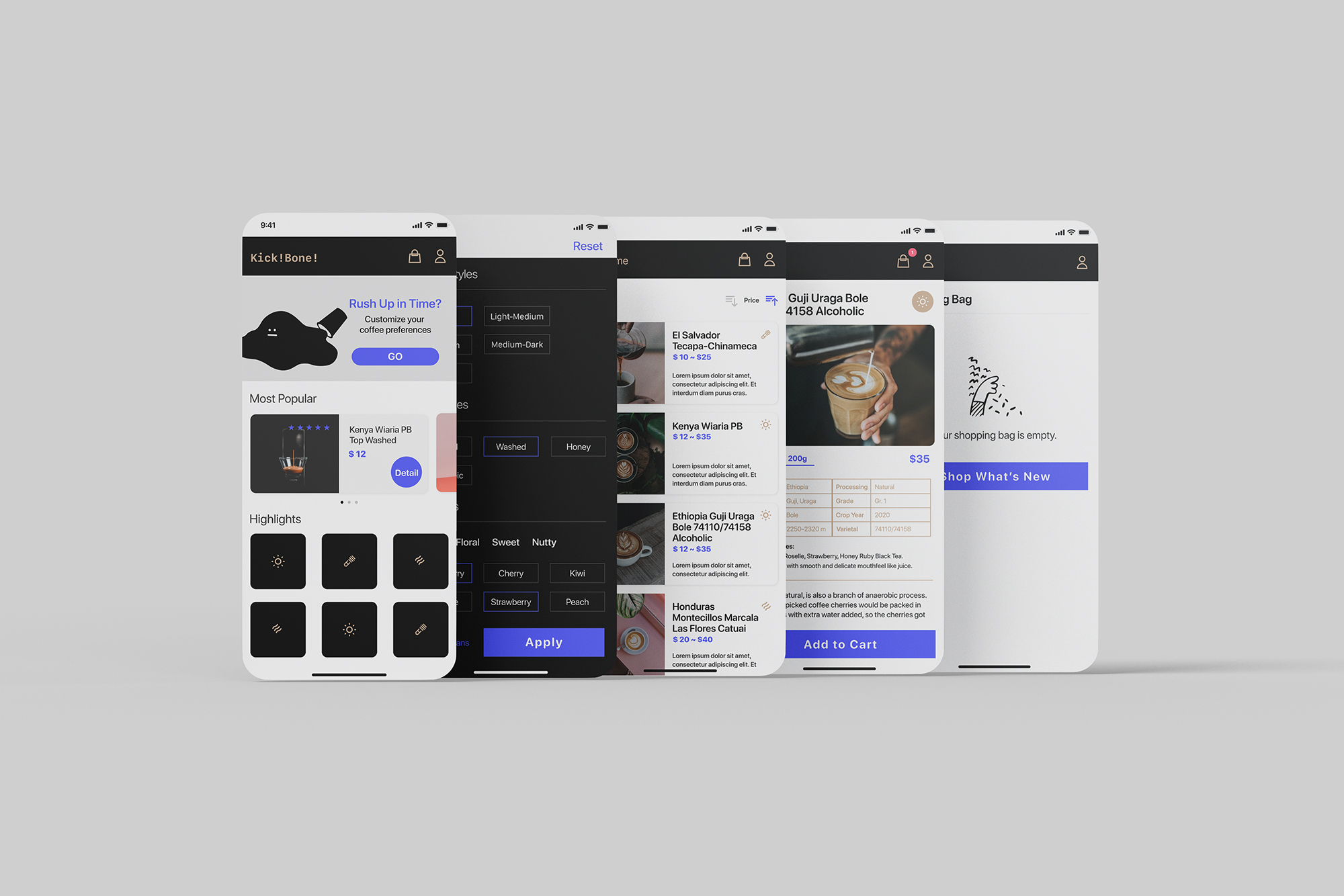
Mockups
Early designs allowed for some customization, but after the usability studies, I moved the filter feature to the top of the screen makes it much easier to be found.
Early designs allowed for some customization, but after the usability studies, I moved the filter feature to the top of the screen makes it much easier to be found.
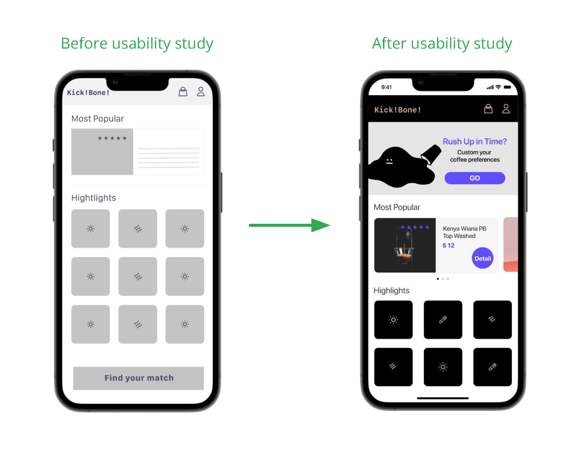
The second usability study
revealed users want to sort
items by price. I added the
sorting feature to help
people make their
decisions.
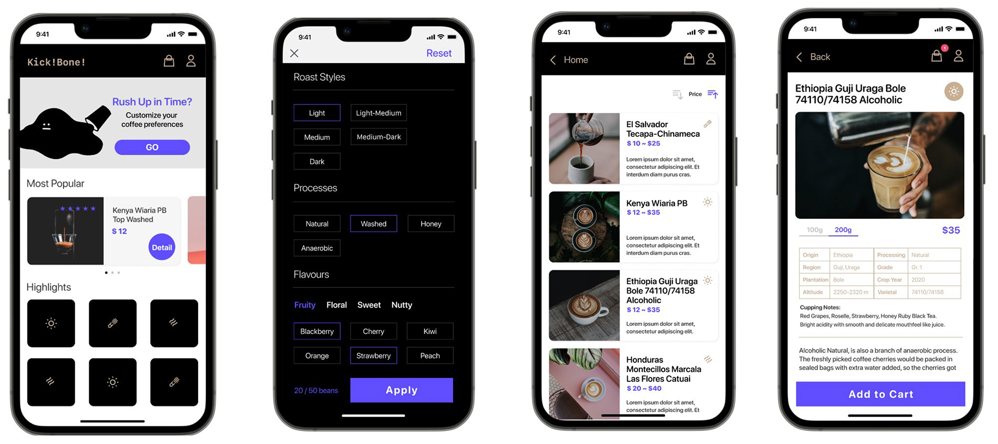
Hi-Fidelity prototypes
The final high-fidelity prototype presented cleaner user flows for buying coffee beans and checkout. It also met user needs for a customized feature and was easy to use.
The final high-fidelity prototype presented cleaner user flows for buying coffee beans and checkout. It also met user needs for a customized feature and was easy to use.
_
Accessibility Considerations
_
Used icons to help make navigation easier.
Set up the speed and duration of motion between 150ms to 500ms for the best practice.
Ensured the good contrast in the text and imagery.
_
Going Forward
_
Takeaways
Impact
The app makes users feel like Kickbone Coffee really thinks about how to meet their needs. One quote from peer feedback:
“I only like certain types of coffee so it is very useful to me. I like the addition of Process section. Great for people who really understand about coffee.”
The app makes users feel like Kickbone Coffee really thinks about how to meet their needs. One quote from peer feedback:
“I only like certain types of coffee so it is very useful to me. I like the addition of Process section. Great for people who really understand about coffee.”
What we learned
While designing the Kickbone Coffee app, we learned that the initial ideas for the app are just the beginning of the process. Usability studies and feedback from peers influenced every iteration of the app's designs.
While designing the Kickbone Coffee app, we learned that the initial ideas for the app are just the beginning of the process. Usability studies and feedback from peers influenced every iteration of the app's designs.
Next steps
Conduct another round of usability studies to validate whether the pain points users experienced have been effectively addressed.
Conduct more user research to determine any new areas of need.